
At various different points, student data is collected on such things as attendance, disciplinary issues, assessments scores, and grades. How do we organize this wealth of information into something meaningful?
One answer is data visualization.
Data visualization can be a powerful tool for you to educate your audience and break down other forms of data intensive information for easier interpretation.
See the below example of how AEM used a vast amount of demographic data to create an interactive visualization for the White House Hispanic Initiative that displays how Hispanic populations increased by state and district over an 8-year period. This presentation served to inform conversations about education resource allocation.
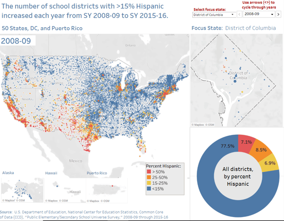 Check out the interactive visualization for a deeper look into how large amounts of data can be compiled to make a useful graphic.
For any presentation which includes data, the audience must feel the data is relevant to them and be able to understand how that data affects them, or the information will be ignored. Using data visualization properly can be a great tool to help you achieve that goal.
Practicing effective data visualization techniques can help make sure stakeholders recognize and take action on the data you are presenting.
So, what are some key effective data visualization practices to follow? What are common data visualization practices to avoid? Let’s review some of the do's and don’ts for data visualization practices in education.
One of the first and easiest ways to approach data visualization is to know your concluding point before you start spending any time creating graphs, charts, or infographics.
Knowing your point before you do the work will ensure the visualizations you choose will be relevant to the point that you’re making. If you know what point you’re trying to drive home, you can then make sure the data visualizations you choose support your point or conclusions.
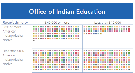
AEM developed the above infographic for the Office of Indian Education which shows key districts not receiving funding.This infographic is simple, to the point, and helps prioritize funding efforts.
Another type of data visualization which is seeing increased utilization in education is the dashboard. Dashboards help education stakeholders see data on one screen and provides your point immediately to the audience because it displays key information and visualizations in an organized, coherent format. To create effective dashboards, consider these design principles.
One common misconception about data visualization is that the visualization tells the audience what they need to know on its own without much additional context.
However, helping the audience build the picture through a story (and not have the focus solely on the visualization) will make your visualizations stronger, will make your data more accessible to your audience, and will help them remember the information for a longer period.
Learning how to develop a data story can be one of the strongest data visualization skills you can have and can be achieved with some thoughtful planning. A story helps your audience organize the points you are presenting in a more logical and consumable manner while keeping them engaged in your presentation.
Learn how to create a compelling data story on the AEM Early Childhood Education blog: Make Data Accessible: 5 Steps to Create A Data Story
To see a great example of an effective data story, see this recently issued brief from Hawaii where the Hawaii State Department of Education explains how they are supporting educators with the strategic use of real time data to address chronic absenteeism through the use of well-placed graphics and charts within their brief.
Everyone loves hearing a good story in any setting and showing data to an audience is no exception. Remember to use your data visualizations to enhance your story telling, not replace it.
In data visualization, less is more. Many of us in education use data visualizations to emphasize a specific point, help the audience arrive at a conclusion, or provide clear options for a decision, so it’s important for them to understand what is being presented. A data visualization which is too complex or difficult to understand can frustrate them or distract them from your main point.
In addition, many simpler charts and graphics can be made with programs you likely already have or can easily obtain such as Microsoft Excel or Google Spreadsheets.
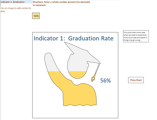
A resource recently created with the assistance of AEM experts and partners is the Part B Data Display Wizard developed for the IDEA Data Center. This is a Microsoft Excel tool to display complex data in an easy-to-follow format with graphs and charts, including the picto chart format shown above, and align with an indicator’s purpose from a state’s State Performance Plan and Annual Performance Report (SPP/APR).
This tool provides a wide variety of examples of commonly used graphs and relevant data displays used for audiences who report and analyze data for special education programs, as well as brief explanations of their purpose.
Sometimes you want to use data visualizations to supplement reporting requirements, but are you providing guidance in how to read and interpret those visualizations?
You may have the right types of graphs or charts which are appropriate for the data and are relevant to your audience, but if you do not give the necessary context, the visualization will not be helpful to them. Thus, it’s important when you present visualizations that as much context is provided as possible.
If you are doing a presentation, tell an engaging story using your visualizations as a guide. If your work is for a website, provide relevant links, data notes, or resources that will help your audience better understand the data and its definitions.
Interpreting a data visualization is more than just understanding what is in front of you. It’s also about whether the audience has time to decipher your message, whether the message is relevant to them, or if the message is competing for their attention (such as sharing data via social media channels).
A beautiful, complex visualization will be of no use if the audience has little time to understand what is in front of them. Make sure to put yourself in the shoes of the people who will be viewing your data visualization, so they will walk away understanding why the visualization is relevant to them and find the right platform to share the data visualization.
One of the best things you can do as you create data visualizations is to have someone else review them to provide constructive feedback. They can provide a fresh perspective and help you make sure that the visualization is understandable and relevant to the audience.
For example, you could ask questions such as, is the legend accurate and consistent with previous definitions of the data elements you’re using? Does the data seem believable from a common-sense standpoint? Is there important information, categories, or totals you may be forgetting to include?
Using a resource such as a data visualization checklist can be useful if you need help on what to look for in your review. Doing a thorough review as you’re building data visualizations can save you from potential headaches later.
Data visualizations are only as meaningful as the data behind them. If you start with faulty data, then even creative data visualizations matched with a well-crafted story would have inherent logical flaws.
High data quality is a necessary foundation for all data systems, but it’s especially important in the creation of data visualizations. Data quality must also be a priority at the district and school level because this often is the easiest place to start correcting data and reviewing data quality processes before it’s reported to the state level.
Get into the data quality mindset: 4 Focus Areas to Improve Local Education Data Quality
Also, it is best to make sure those staff who have created the data visualizations know what type of data is being collected and how the data elements used are specifically defined.
For example, graduation rate in one state can mean something completely different in a neighboring state and a visualization should make sure to account for this. Consider using definitions under a data standard such as the Common Education Data Standards (CEDS) if you don’t have clear definitions of data elements for your data systems or visualizations.
The biggest faux pas in data visualization is using data to intentionally misinform or lead people to make the wrong conclusions.
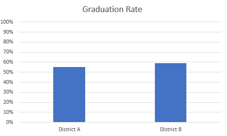
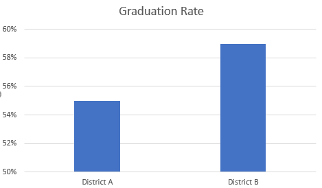
Look at the above example charts. The graduation data is the same (District B had a 4% higher graduation rate than District A), but the major difference is the graphical representation of data in the intervals used on the Y-axis. This is a common practice when trying to make a specific point, but data intervals should always be reviewed and any intervals which could be misleading should be avoided as much as possible.
There could be other questions which need to be addressed such as if the definition of graduation rates is similar for both districts or if the districts themselves are similar in composition. This is another reason why it is very important to share your data visualizations with others to ensure that you are not misleading your intended audience.
Otherwise, you may lose their trust when you need them to make important decisions.
Just like you wouldn’t turn in a paper to a teacher with misspellings and grammar errors, this same basic rule applies with data visualizations. This is especially true with infographics which tend to be heavier in text or need more intensive study by audiences.
It can be exhausting for a stakeholder if they take a significant amount of time to look at a visualization only to come across spelling, grammatical or other careless errors. These types of mistakes can quickly erode the trust of your audience.
Data governance can address these types of challenges and communicating the value of data governance to your stakeholders can help reduce or eliminate these types of issues.
This list is by no means a complete list of do's and don’ts for all the charts, graphs, and infographics being shared in today’s presentations. However, by sticking to these basic points, you will have a strong foundation to create high quality, appealing, and informative data visualizations.
If you need help finding the perfect graph or chart, AEM data visualization experts can help you craft an engaging story using your data. If you have questions, feel free to contact us. Make sure to check out this brief of our expertise and background in data visualization, too.
AEM is thrilled to announce that the Arkansas Department of Education (ADE) is piloting ADAPT — the Accessible Data Analysis and Publishing Tool developed by AEM as part of the Rhonda Weiss Center for Accessible IDEA Data. This collaboration marks a significant step forward in making IDEA Sections 616 and 618 data more useful, transparent, and accessible for all.

We are excited to share that AEM has been awarded a new cooperative agreement from the U.S. Department of Education’s Office of Special Education and Rehabilitative Services (OSERS) to operate the Center for the Integration of IDEA Data (CIID).

Below is a selected expert from a blog post AEM co-authored with the Georgia Tech Center for Inclusive Design & Innovation and posted through the Rhonda Weiss Center for Accessible Individuals with Disabilities Education Act (IDEA) Data. The post explores updates to the Title II regulations of the Americans with Disabilities Act (ADA) and how state and local governments can ensure compliance. This post was co-authored by AEM's Charlie Silva and Johan Rempel from the Georgia Tech Center for Inclusive Design & Innovation.


![]()
![]()

